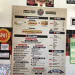
This is a newly redesigned menu by JimmyJohns sandwich chain store, here in Texas. I am a regular to this place and when I first saw this menu board I was really confused. When you stand in line to order, this menu board is about 6-7 ft away from you, to help you choose what items you would like to order. The first thing that threw me off was the hike in sandwich prices! $8, $9, $10 and so on. I know for the fact they don’t cost that much. I began thinking that I should find another place next time for my lunch.
Now take a look at this image again. The $8,$9,$10 are not really the prices but the item numbers! What? Yes, they are the item numbers so that you say I want “number 9 please”. Do you see the problem here? The mental model we have from other food chains are conflicting here with this “#” in front of the item. I’m sure many new customers think those are the prices rather than just item numbers, until you really reach to the board.
How to improve this? More than one way for sure. One way is simply take out the # sign and make the numbers within a solid color circle, like those red circles in the picture. Your ideas?
