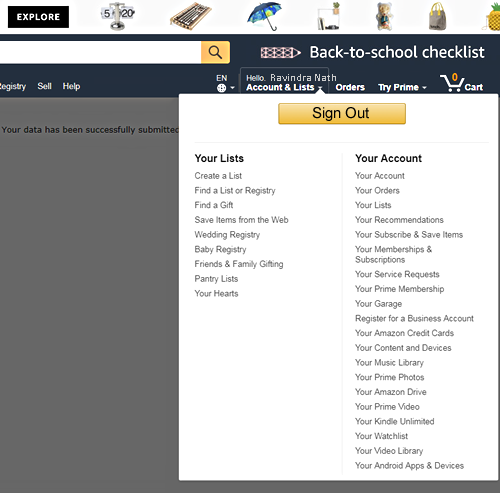
Greed wins, even for Amazon. This issue has been discussed elsewhere, but adding it to the blog so the blog is alive. In grocery stores, milk is placed at the back. In big box warehouses like Costco, they keep on moving the merchandise locations. The underlying principle is, the more time you spend in store the more you buy… and it has been working good for retail industry. Does it work online? In case of Amazon, as you can see the logout link/button is hidden in the plethora of menu items, that too all the way in the bottom. Very hard to find it and then very hard to click the target if you are not using the mouse. On some monitors you have to scroll to see the logout link. Amazon is known for one click orders and good usability. Do you think they missed the best practice here? I doubt it. I’m sure some genius calculated some $numbers and recommended to make it difficult to log out. Greed wins at the end. I just added a Logout button on my own to enhance a good design. I’m not greedy.
